UI/UX for Budge App
About Budge
Budge is a convenient and pleasant tool for financial planning. When the project started, the customers had created the program's mechanics, but they lacked a name, identity, and design for the application. That's precisely where we stepped in to assist them.
Our Process
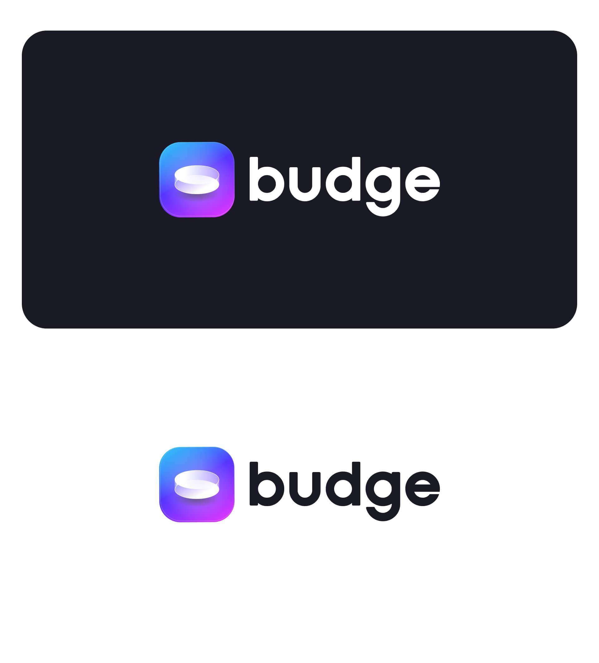
To begin with, we conducted market research and embarked on finding a suitable name for the app. Many of our competitors had names containing terms like "wallet," "tracker," "money," and so on. Consequently, we swiftly dismissed those options. Following an extensive search, we settled on the name "Budge," which bears resemblance to the word "бюждет" and incorporates the ending "Ge" as a nod to the word "genius." As a result, the application's slogan will be “become a budgeting genius.”
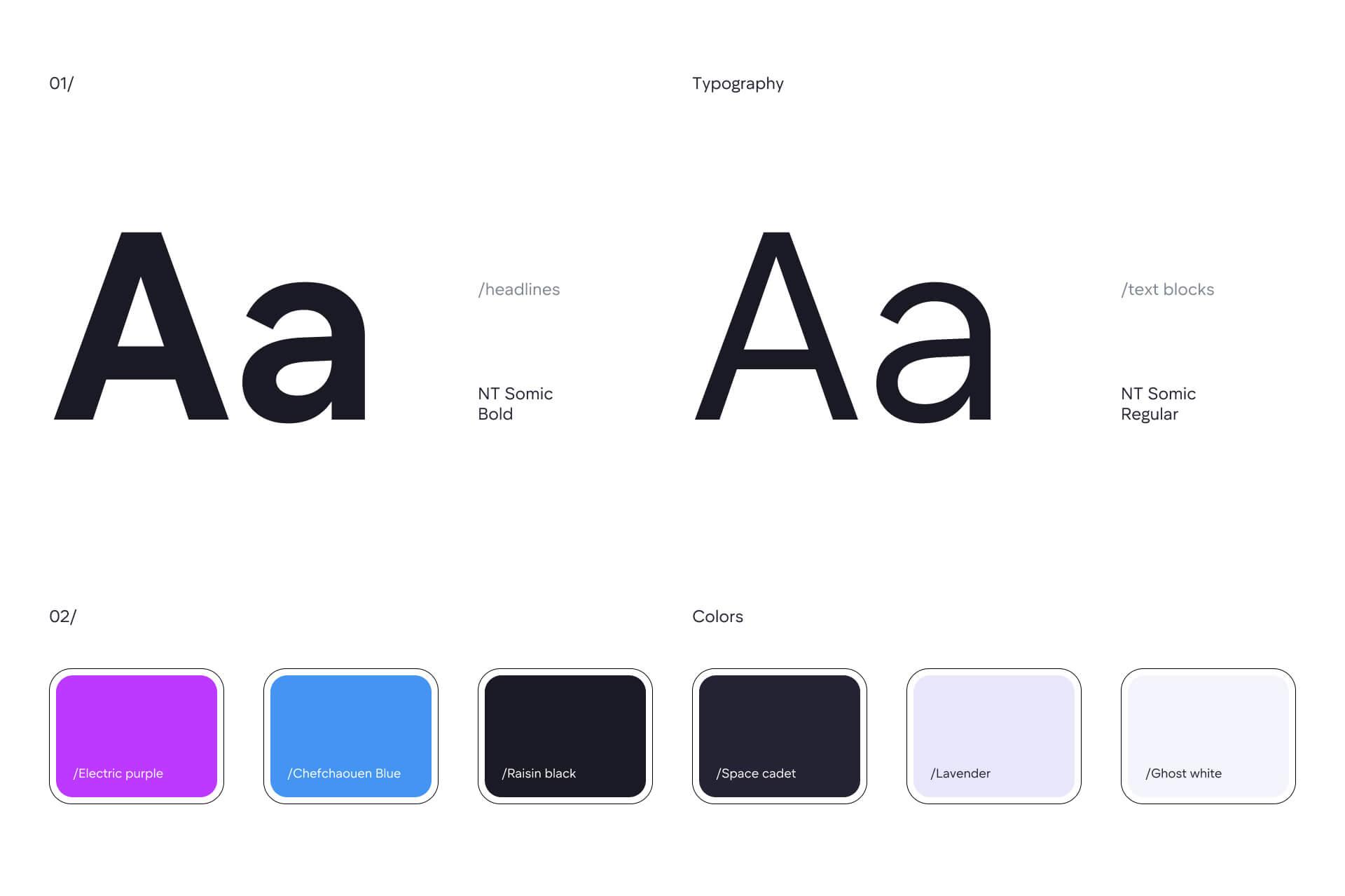
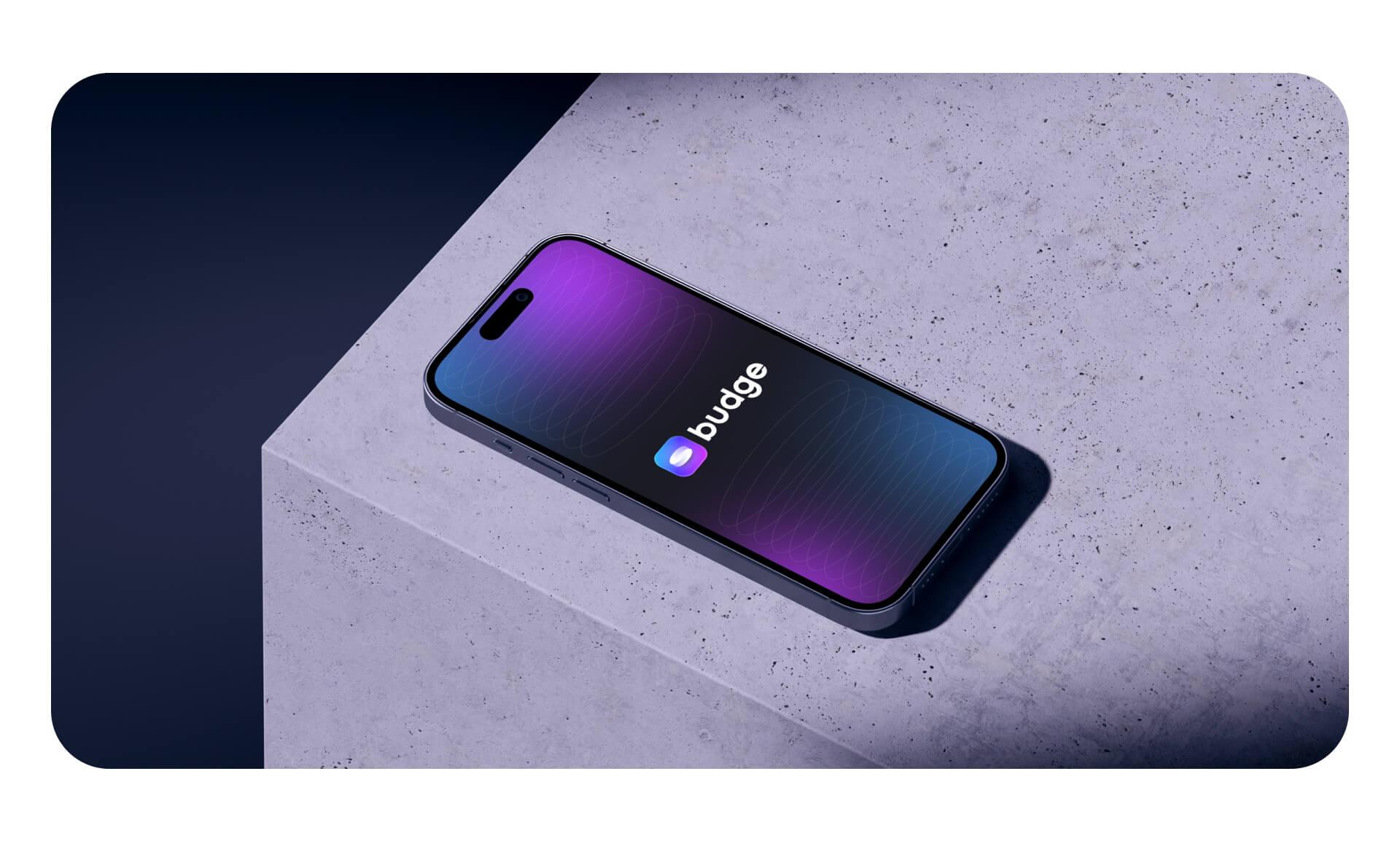
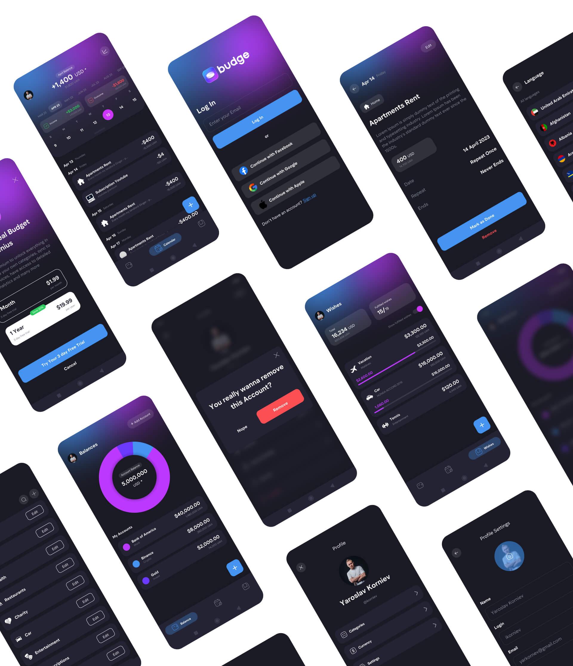
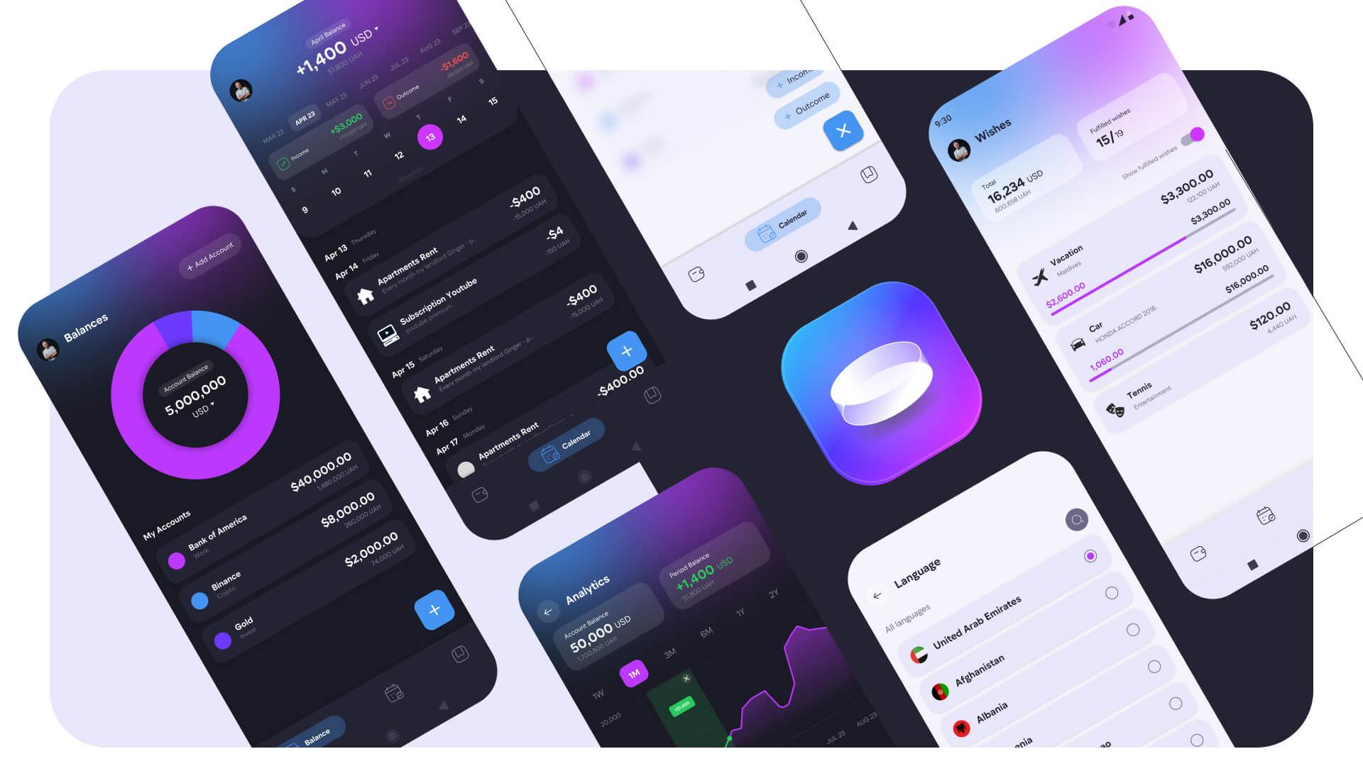
After finalizing the name, our focus shifted to the visual design aspect. Our primary objective was to distinguish ourselves from existing applications in the market while maintaining a vibrant and contemporary look. Therefore, we opted for a dark theme complemented by striking neon colors, a distinctive feature rarely found in similar apps.
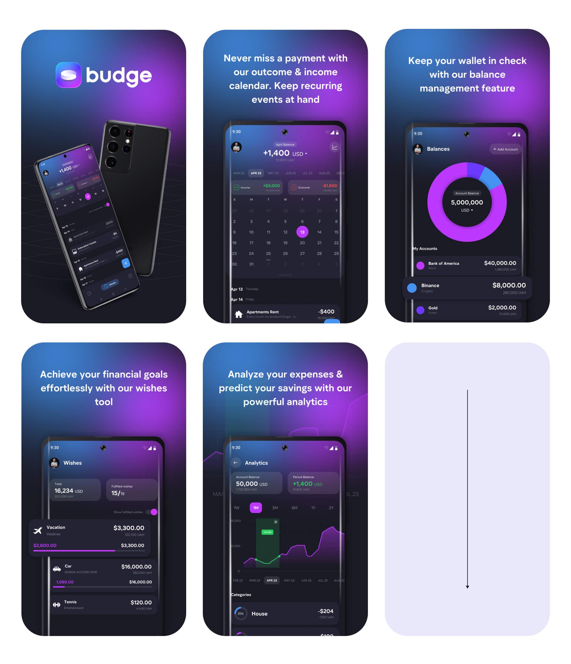
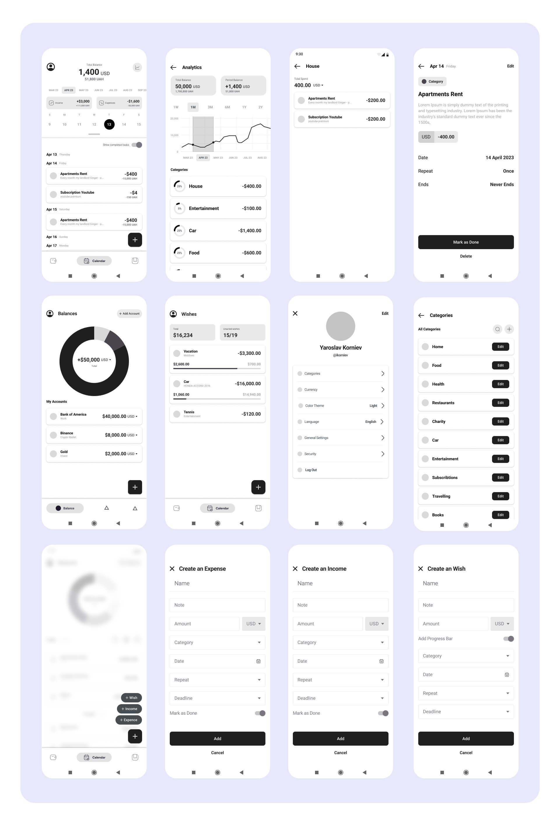
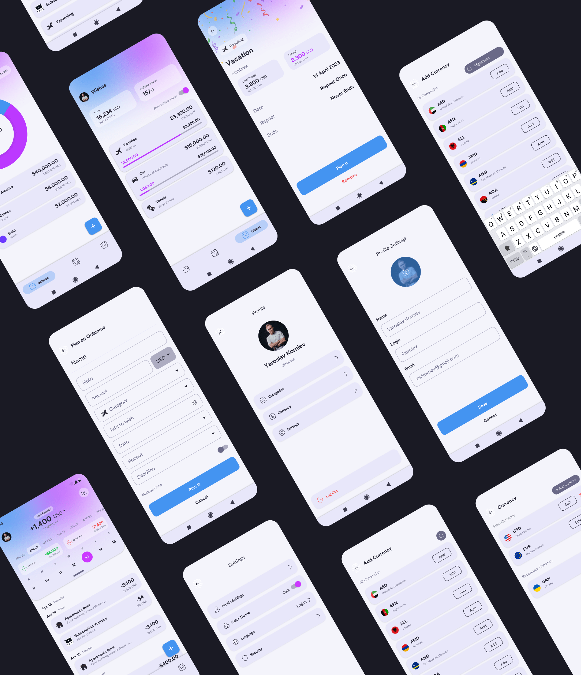
The final stage involved designing the application's interface. We redesigned the appearance of certain functions, introduced several new features, and made them intuitive for users to understand.